ST. GEORGE – What symbol best represents St. George and what it stands for? After two years of research, city officials announced their answer Thursday as a new city logo was introduced to the public.

After examining many things St. George is known for, such as the sun, red rocks, blue skies, trees, the St. George Opera House, tourism, the St. George Temple and Tabernacle for The Church of Jesus Christ of Latter-day Saints, and other landmarks and attributes, officials settled on what is perhaps the region’s most prominent fixture.
“The obvious choice was the sun,” said Marc Mortensen, assistant to the city manager.
The new logo is a yellow sunburst that has many meanings to it, Mortensen said. The sunburst, which can appear similar to the spokes of a wagon wheel or bicycle gear, is accompanied by the phrase “The Brighter Side” and the St. George name – minus the “City of” attached.
See video top of this report.
“We’ve really spent the last two years working through a rebranding effort to get to the foundation, the pillars of what the city is, what we stand for and what the public should be able to count on from us,” St. George Mayor Jon Pike said.
However, before aspects of the new logo are explained, what about the original logo?

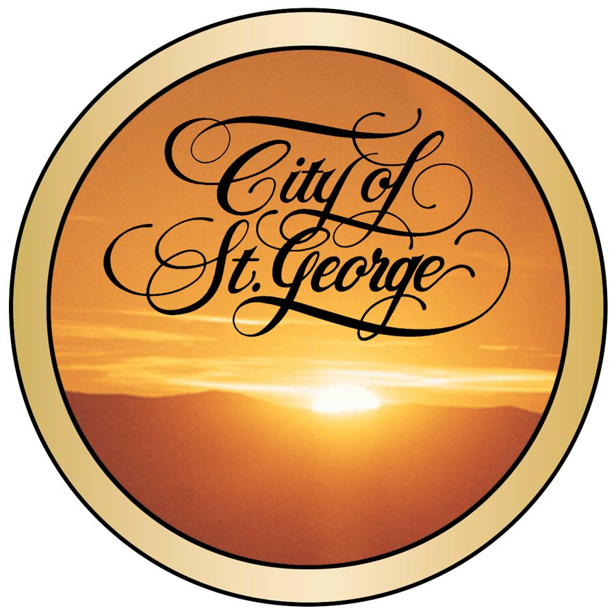
Long-term and native residents will likely recognize the logo the city has had since the 1970s – the “City of St. George” written in a form of calligraphy set against an orange sky with the sun setting behind the hills and bordered by a golden ring.
The long-lived logo has a sentimental value to those familiar with it, Mortensen said. Yet, for a large part of the city’s population that has moved here in the last 10-15 years, there’s little relating to the emblem. All they see is an orange blob, he said.
After 40 years of the same logo, time had come for an update. The old logo won’t be completely phased out, though, Mortensen said. It will be incorporated into the official seal of the City of St. George and still used on signs in the city’s historic district.
The process of piecing together a modern successor to the old logo proved to be a “highly emotional process,” said Justin Jenkins, of consulting company Se7en Creative, which aided in the creation of the new logo.
City officials and consultants reviewed logos from other cities, both those they found good and bad, and also sought opinions from city department heads and employees along the way. Even when it was decided the sun would be a focal point of the new logo, the process of picking associated colors, a possible slogan and text font still had to be ironed out.
“You want to take a symbol down to the purest form you can – say a lot in a little,” Jenkins said.
As the process unfolded, two words arose that officials believe sum up St. George very well: activity and optimism.
“We think that describes us,” Mortensen said.

Activity is seen as a defining characteristic as there always seems to be some kind of activity or event happening in the city. Optimism is considered synonymous with the “Dixie Spirit,” which itself is described as a sense of cooperation, friendship and unity, among other positive traits.
As the logo came together, the phrase “The Brighter Side” was also chosen.
“We are definitely, without question, the brighter side of Utah,” Mortensen said.

St. George can be the brighter side for many different people for many different reasons, Pike said.
For the 20-something-year-old student at Dixie State University, she may see a bright future for herself as she pursues higher education. For the retirees who have moved to St. George, they may see a brighter future as they spend the rest of their days under the sun.
There was also purpose in the colors chosen for the new logo. The yellow of the sunburst is bright and optimistic, Mortensen said, while the blue aspect of the lettering can represent leadership, clear blue skies and life-sustaining water.
The design of the sun also has relevance on many different levels, officials said. The sun represents the not only the weather and climate but also aspects of tourism and retirement. These aren’t the only elements, though. Among other elements, there is a nod to pioneer heritage with the hint of a wagon wheel; industry and enterprise with the comparison of the sunburst to an industrial gear, a beacon of leadership when the sun is placed on a tower.

“I think it speaks well to who we are and where we are and where we’ve been,” Pike said. “(It) speaks to our history, speaks to our future and what we’d like to be – the brighter side.”
City officials hope the new logo becomes so common, Mortensen said, that when people see it, they think St. George.
The rollout of the new logo will be gradual and take about 18-24 months, Mortensen said estimating. There won’t be a sudden frenzy of logo-replacement, he said, but rather a phased process.
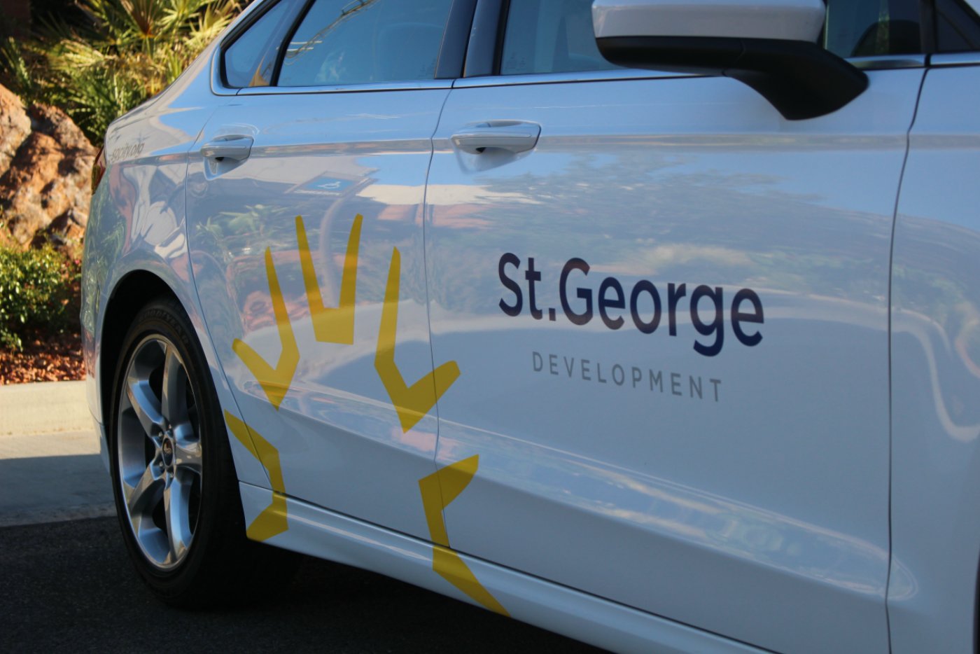
City signs, vehicles and various other items will have the new logos as opportunity arises. For example, city stationery and business cards with the new logo won’t arrive until the need to order new supplies approaches. As well, city vehicles, which are among the city’s more visible billboards, will be outfitted with the new iconography when they go into the shop for maintenance.
The process of creating the new icon has cost the city around $12,500.
“We’re really happy with the outcome,” Mortensen said.
Click on photo to enlarge it, then use your left-right arrow keys to cycle through the gallery.

The new logo of the City of St. George is already in use at the St. George City Offices. The new logo was rolled out July 7, 2016, and is anticipated to be phased in citywide over the next two years, St. George, Utah, July 7, 2016 | Photo by Mori Kessler, St. George News

The City of St. George's long-lasting logo from the 1970s which is now being phased out for a more clean and modern design. Elements of the logo will be incorporated into the official seal of the City of St. George. | Image courtesy of the City of St. George, St. George News

A graphic illustrating the many meanings and elements that went into St. George's new logo | Graphic courtesy of the City of St. George, St. George News

The new logo of the City of St. George is already in use at the St. George City Offices. The new logo was rolled out July 7, 2016, and is anticipated to be phased in citywide over the next two years, St. George, Utah, July 7, 2016 | Photo by Mori Kessler, St. George News

The new logo of the City of St. George as it will appear on city vehicles. The new logo was rolled out July 7, 2016, and is anticipated to be phased in citywide over the next two years, St. George, Utah, July 7, 2016 | Image courtesy of the City of St. George, St. George News

The new logo of the City of St. George featured at the St. George City Offices. The new logo was rolled out July 7, 2016, and is anticipated to be phased in citywide over the next two years, St. George, Utah, July 7, 2016 | Image courtesy of the City of St. George, St. George News
Email: [email protected]
Twitter: @MoriKessler
Copyright St. George News, SaintGeorgeUtah.com LLC, 2016, all rights reserved.


So is this basically Legend Solar’s logo?
Yea, without the yellow circle in the middle.
Genius, pure genius. Wonder how much that unique logo set the City back?
Sheeesh.
i feel like this logo isn’t lds enough. couldn’t they put a silhouette of the temple with it?
There it is folks ! another stupid example of dumbob’s ignorance
It’s a fine symbolic emblem, but it doesn’t need to replace the calligraphy. And certainly, let’s hope they get more creative with the font for the text! I would have come up with something better for half that cost.
We are looking like Wal-Mart now. SMH. I need to figure out a way to get on these advisory panels. I could use some easy cash.
The new logo and branding look absolutely terrific! I am thrilled to see how simple, yet elegant it is. Way to go St. George! So proud of our city!
I like it two
The new St. George WALMART LOGO…